
Final Step: Bring Everything Together
The last and final steps in order to create your business cards are:
1) You will have to put a lot of visuals on one sheet of paper – try to do that on a rather big sheet – it will provide more space for you.
2) Start out with simpler, smaller sketches before you go big.
3) When you switch to the big paper, use a pencil first – because you do not want to ruin an overall design at the very end when working with a marker.
4) Then start using the marker and go over your pencil sketch.
5) Add further details, colours, shadow and connectors.
6) If you want to make your card smaller - take a photo and adjust the size digitally.
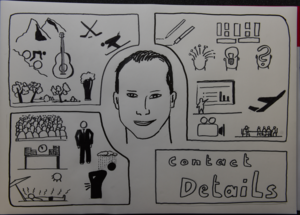
"I started working on my final version, taking all the individual parts into consideration. While I had worked in my sketchbook for the individual parts, I now used some larger paper to have more space and options to place the icons. I did this in A3 to have a lot of space. A further advantage of this approach is that when you are finished and you take a photo, you can reduce the size and suddenly all your sketches look much more professional through the shrinking process. Give it a try! Here is my final version. First the pencil draft, and then with marker and colours. It is not yet perfect but it is a good first shot at how a professional business card based on visuals could look like! I also have to admit that my personal portrait turned out much nicer than reality. Well, it probably rather represents me a couple of years ago. However, I decided to keep it that way – and you can and should do so, too!" ☺


My Personal Card

I was going to add colour, but I decided that the black-and-white suited me better. It's too bad the scanner clipped the outline a bit on one corner.

Nice!
Thanks. :')
very good result and I agree with the b/w choice - makes it look really professional!