
en
Visual Thinking for Business - Make Your Point
The last and final steps in order to create your business cards are:
1) You will have to put a lot of visuals on one sheet of paper – try to do that on a rather big sheet – it will provide more space for you.
2) Start out with simpler, smaller sketches before you go big.
3) When you switch to the big paper, use a pencil first – because you do not want to ruin an overall design at the very end when working with a marker.
4) Then start using the marker and go over your pencil sketch.
5) Add further details, colours, shadow and connectors.
6) If you want to make your card smaller - take a photo and adjust the size digitally.
"I started working on my final version, taking all the individual parts into consideration. While I had worked in my sketchbook for the individual parts, I now used some larger paper to have more space and options to place the icons. I did this in A3 to have a lot of space. A further advantage of this approach is that when you are finished and you take a photo, you can reduce the size and suddenly all your sketches look much more professional through the shrinking process. Give it a try! Here is my final version. First the pencil draft, and then with marker and colours. It is not yet perfect but it is a good first shot at how a professional business card based on visuals could look like! I also have to admit that my personal portrait turned out much nicer than reality. Well, it probably rather represents me a couple of years ago. However, I decided to keep it that way – and you can and should do so, too!" ☺

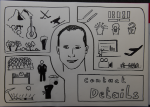

Finally I made it! After I used the fineliner I had the impression that the card got too black. I tried to use some colours (beside the red and green for "don't like" and "like") and found that pretty difficult (not too many colours, not using the red and green in a way that does not fit to the "like/don't like"-meaning). At least this is the only self-portrait I made which looks at least a little like me.
All in all I like the result (knowing where I've started few weeks ago).

Joignez-vous à:
I like the bright gray. It has such a great effect. I would like to have such a pen, too :-)
very nice result!!